Unified Calendar
One screen for every calendar you’ve connected — work, personal, shared, holidays — with the side-rail toggles, color controls, view switcher, search, and event editor all in one place. This guide walks through every piece of the page in the order you’ll meet it.
Open your unified calendar
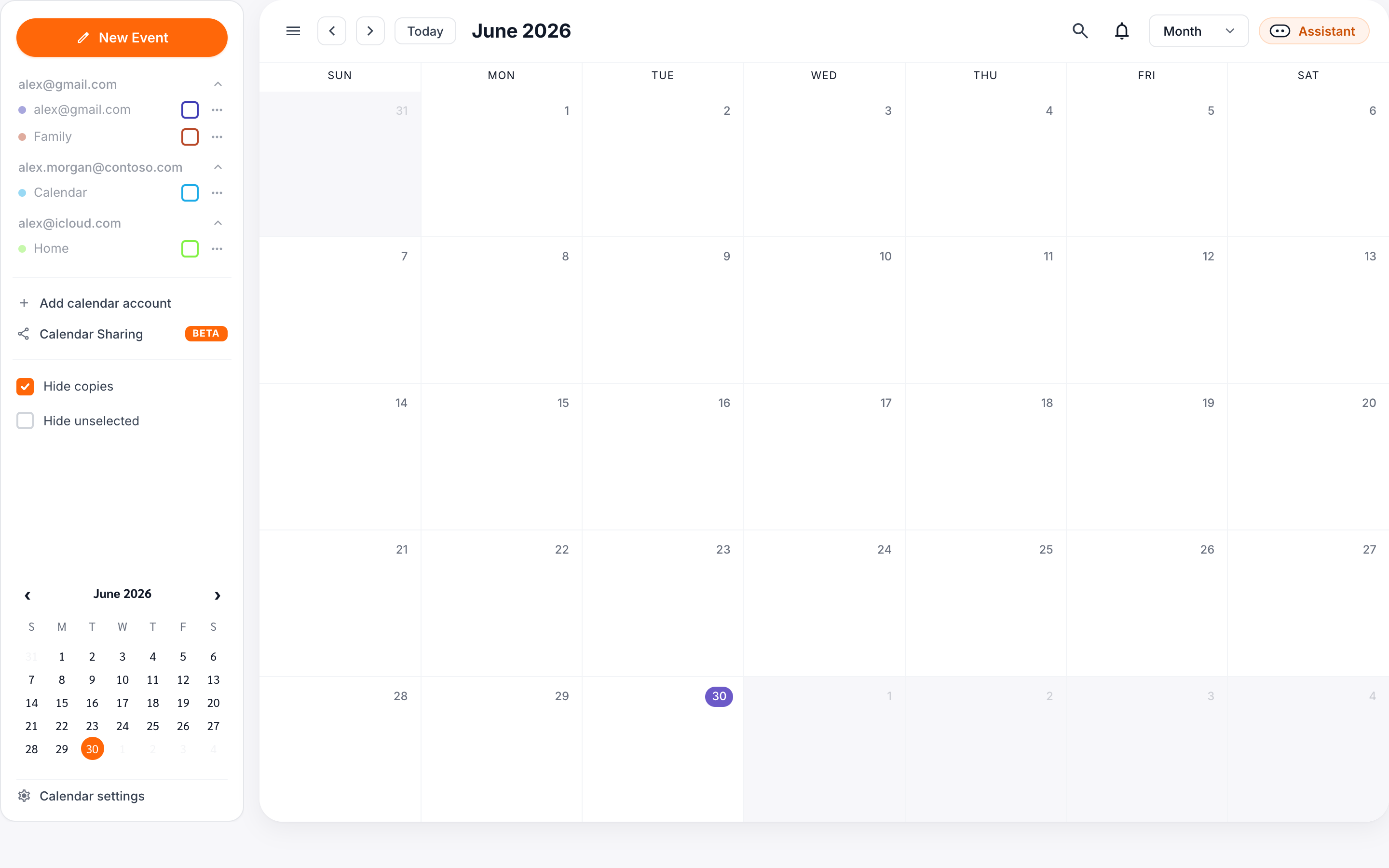
Click Calendar in the side rail of the dashboard. Every event from every connected account renders into a single month grid, with a sidebar on the left for filtering and a header above the grid for navigation. If you only connected one account, you’ll still get a unified view — synced placeholders and source events both show up here.
The layout has three regions:
- Side rail with the orange New Event button, your account header, the list of calendars, display options, a mini-month, and Calendar Settings at the bottom.
- Toolbar with month navigation, the view switcher, the notifications bell, and the AI Assistant button.
- Month grid where events appear as colored chips inside each day cell.
Today and date navigation
Today’s date is always rendered as a filled circle — purple in the main grid, orange in the sidebar mini-month. Use ‹ and › in the toolbar to step one period at a time, or click Today to snap back to the current period. The mini-month in the sidebar also has its own chevrons and updates in step with the main grid.
Switch views: day, week, month
The view switcher sits on the right side of the toolbar, just left of the AI Assistant button. It defaults to Month. Click it to open a dropdown with three options:
- Day — a single column for the focused date, with all events laid out by time.
- Week — seven columns, Sunday through Saturday by default.
- Month — the standard 7-by-5 (or 7-by-6) grid.
The current view is marked with a purple highlight and a check. The toolbar title and the ‹/› buttons rescale automatically — in Day view the title shows a single date and the chevrons move by one day; in Week view they move by seven; in Month view they jump a full month.
D, W, and M switch views from anywhere on the page. T jumps to Today.Filter calendars on and off
Every calendar you’ve connected shows up as a row in the sidebar, grouped under the account it belongs to. Each row has three controls:
- A color dot on the left identifying the calendar.
- The calendar name in the middle — click the label to toggle visibility on or off.
- A check box on the right that mirrors the same state. When unchecked, that calendar’s events disappear from the grid and the mini-month.
- A ⋯ menu for per-calendar actions like changing color, resetting color, or “Show only this calendar.”
Below the calendar list are two display toggles that apply across the whole grid:
- Hide copies — hides synced placeholder events. Turn this on when you want to see only the original events; useful if you have heavy back-and-forth syncs and want a less cluttered view. (On by default.)
- Hide unselected — collapses the sidebar list down to only the calendars you have toggled on. Helpful once you have a lot of accounts connected.
Show only this calendar
Open the ⋯ menu on any calendar row and choose Show only this calendar. Every other calendar is toggled off in a single click. To get everything back, tick the boxes again or use Calendar Settings.
The sidebar also holds the Calendar Sharing link, which creates read-only public feeds of your calendars — a web view, an ICS subscription link, and website embed code. See Creating a Shareable Calendar.
Color-code by source calendar
Each calendar has a color that determines how its events appear in the grid — the chip background, the left accent bar, and the dot in the sidebar all derive from this single value.
Change a calendar’s color
Open the ⋯ menu on the calendar row and pick a swatch from the 11-color palette. The change applies immediately — every event from that calendar repaints across the grid, the mini-month, and the event-details popup.
Custom color
Need an exact brand or family color? Click Custom color at the bottom of the swatch grid to open a hex / HSL picker. Custom colors are remembered per calendar across sessions.
Reset color
If you want to undo your overrides, click Reset color in the same ⋯ menu. The calendar returns to the default we picked when you connected the account.
Create & edit events across calendars
New events
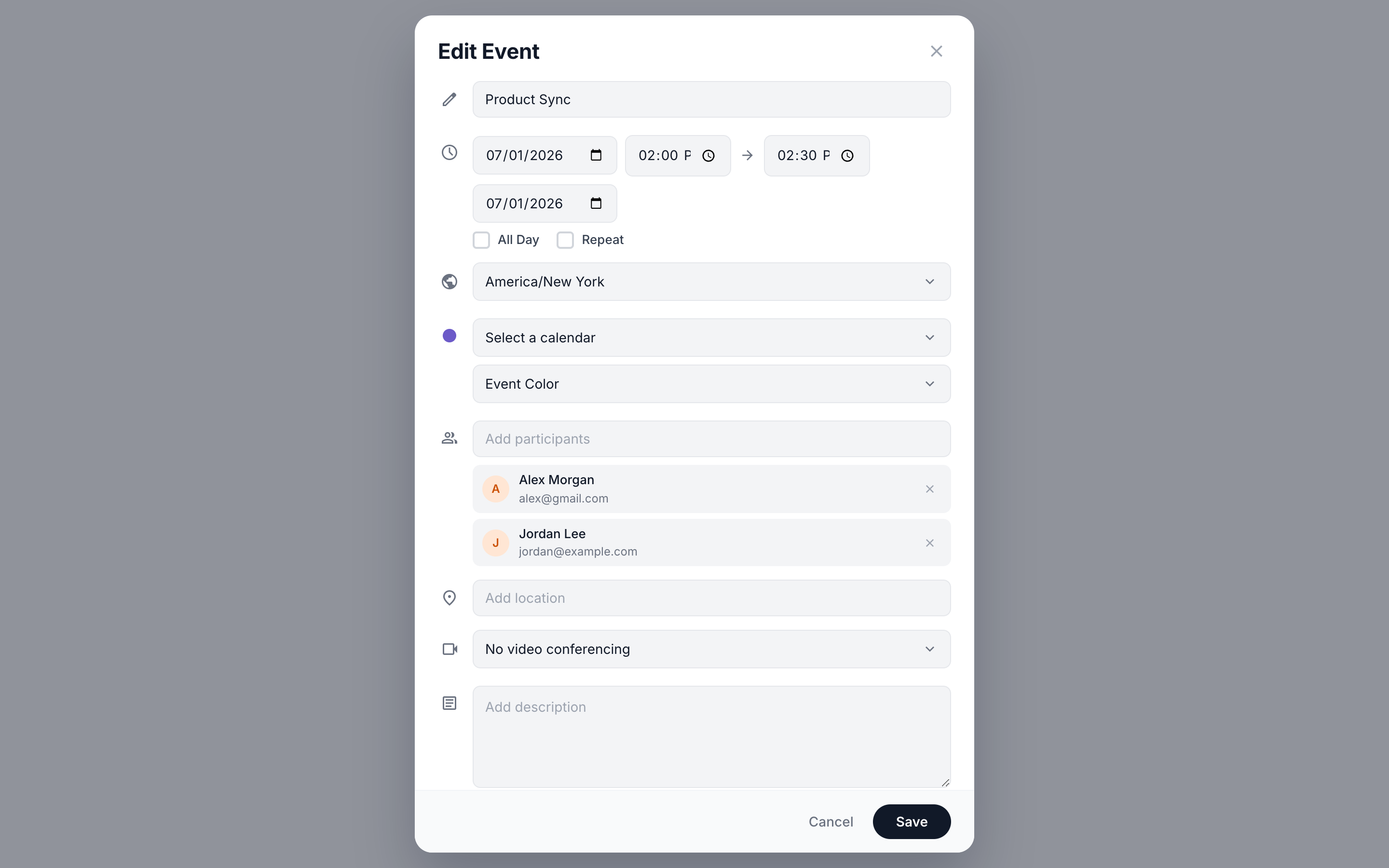
Click the orange New Event button at the top of the sidebar to open the new-event modal. It works the same regardless of which account or calendar you’re viewing — pick the target calendar inside the modal.
-
Title and time
Type a title, then set start and end. Toggle All day to drop the time fields, or Repeat to add a recurrence rule (daily, weekly, monthly, yearly, or custom; ends never / on date / after N occurrences).
-
Pick the calendar
Choose any of your connected calendars from the dropdown. Read-only calendars (US holidays, birthdays) are listed but disabled — events have to live on a writable calendar. The colored dot next to the dropdown previews the chip color you’ll see in the grid.
-
Event color (optional)
By default the event uses the calendar’s color. Click Event color to override it with one of 11 swatches — useful for tagging focus blocks, travel, or specific clients within a single calendar.
-
People, location, conference
Add participants by typing email addresses and pressing Enter. Pick a video conferencing provider — Google Meet, Microsoft Teams, Zoom, or None — and CalendarBridge generates the link when you save. A free-text Location field handles physical addresses or rooms.
-
Busy, visibility, notes
Mark the event as Busy or Free, set Visibility (Default, Private, Public), and add an optional description. Click Save to create it on the chosen calendar — and on every calendar paired with it via an active sync.
Edit an existing event
Click any event chip in the grid to open the event details popup. It shows the time, calendar, location, attendees, and description, with toolbar icons for Edit, Delete, and Close. Read-only events (holidays, birthdays) hide the Edit and Delete buttons.
Editing recurring events
When you click Edit on a recurring event, a small popover asks which occurrences to change:
- This event — change just the single instance you clicked.
- This and following events — change this instance and every future one.
- All events — change every past and future occurrence in the series.
The same scope choices appear when you delete a recurring event — with a warning that the change is irreversible.
Drag, resize, and reschedule
In Day and Week views, every event is a draggable block. Use it to reschedule without opening the modal:
- Drag the body of an event to move it to a new time or day. Snapping is 15-minute by default; hold Alt for free placement.
- Drag the bottom edge to change duration. The event resizes in 15-minute increments.
- In Month view, drag a chip to a different day cell to reschedule by date. Duration is preserved.
Every drop opens a confirmation strip at the top of the grid: “Move ‘Acme Q3’ to Apr 23, 1:00 PM?” with Move / Undo buttons. If the event has attendees, you’ll be asked whether to notify them.
Search across all calendars
Press / or click the search icon in the toolbar to open the search overlay. It searches event titles, descriptions, locations, and attendees across every connected calendar — not just the ones currently toggled on.
Results group by calendar, with the chip color matching the source. Click any result to:
- Jump the grid to that date in your current view.
- Open the event-details popup pre-focused on that occurrence.
The query box accepts simple filters: from:sam@acme.com, cal:work, before:2026-05-01. Combine them with plain text — for example, cal:work review before:2026-06-01.
Use the unified calendar on mobile
On phones, the layout collapses to a single column with the month grid front and center. The sidebar becomes a slide-over panel:
- Tap the Calendars pill at the top of the screen to slide the sidebar in from the right. All the same toggles, color controls, and Calendar Settings link are available.
- Tap anywhere outside the panel — or the ✕ in its top-right — to dismiss it. The grid stays in place.
- Tap any event to open the same details popup; it expands to fit the viewport and remains scrollable for long descriptions or attendee lists.
The dedicated CalendarBridge mobile app uses the same unified-calendar model, plus native swipe gestures: swipe left/right on the grid to change period, swipe down on a day cell to expand it inline.